In the following I would like to describe how I convert scanned color negative films with the free software Davinci Resolve into color-correct, beautiful positives. There are many paths here, this is only one of them: mine. 🙂
Starting requirements
I assume here that the scanned color negative already resides on a timeline in Davinci. The whole thing then looks like this, here a view of the Cut page:

Step 1: Invert, and remove the mask
To invert the negative and remove the mask in a mathematically correct way, I use the ancient, free OpenFX plugin ColorNegInvert from Elois du Bois’ Kaliscope project. The official version 1.0 is available here, but it does not run on current Macs with “Apple Silicon” (M1, M2, etc) processors. I have therefore ported it to arm64 and recommend using my fork with version number 1.1.
After the installation the plugin will be activated. To do this, switch to the Color area (in the bar at the bottom). An empty node “01” should now appear here. If it does not, simply click on “Nodes” in the upper right corner:

On the right, we now see the Effects panel (if necessary, activate it by pressing the Effects button, also on the top right). At the very bottom of this list we see the plugin, easily recognizable by its butterfly icon. We now drag this effect to our Node 01:

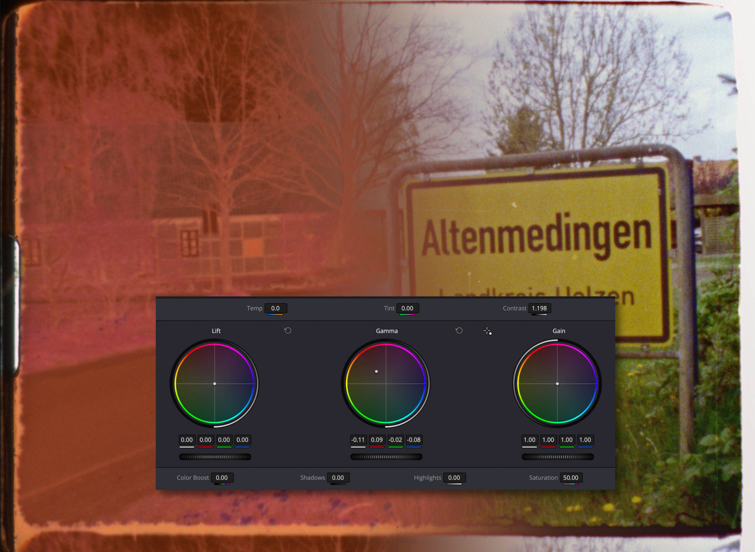
…and immediately the video appears positive, but most likely still looking very flat and with completely wrong colors. So please don’t be alarmed if your result looks much more miscolored than mine, because we’ll correct that in a moment. To do this, we need to determine the base color of the mask, for which we need an unexposed frame, e.g. a frame from the very beginning or from the last remainder of the cartridge. Attention, a completely exposed (i.e. dark) single frame (for example from a cartridge that has been removed from the camera briefly) is not suitable!
To do this, briefly deactivate the plugin with the button (1) in the upper right corner and then take a screenshot of the mask color (2):

This is now to be opened in Photoshop or a similar image editing software. If you have scanned single frames, you can of course open the corresponding single frame directly instead. If there just is no unexposed frame, you can also use a piece of film edge, but this requires an open gate scan and is not as accurate.
To average the pixels (or imaged dye clouds) that have different colors, especially with high-sensitivity material, we use the “Average” filter on the whole image. Of course, a very generously sized blur filter will also work.

The surface is now completely homogeneous, and the info window tells us the color of the mask. In my case RGB 182-104-54:

These three values will now be transfered to the (re-activated) ColorNegInvert plugin:

Now the whole thing should already look much better! However, the image certainly still has a strong color-cast and probably also looks too bright or too dark. What we need now is better basic filtration. Anyone who has ever made RA-4 color prints in the darkroom knows this.
Finding the right basic filtration is a bit of a matter of feeling, but mostly of experience. The only thing that helps here is to approach it with patience and the excellent tools that Davinci Resolve offers for this.
What you should know in advance about basic filtering is that it is usually not applicable to the entire film. If there are large density jumps (i.e. incorrect exposure) or strong changes in color temperature, you need scene-specific basic filtrations. However, these can be derived quite easily from each other and also be managed well, so that you do not have to constantly reset everything yourself.
To find the basic filtration we only need
Three important tools
- Our eyes
- Three controls for the “Mask color” values of the ColorNegInvert plugin
- The Waveform Scope
The eyes are the most important tool for judging what we dial in. However, they also need a good monitor, ideally color-calibrated. If you have a modern Mac, you are usually already all set—with external, uncalibrated, inexpensive monitors, you can experience colorful surprises when you look at the result elsewhere later. It is also important to know that the eye tends not to be objective. That’s okay, though, because the most important thing is that we like the result, not that it’s perfect. At the very least, however, you should make sure that gray tones are reasonably colorless; an occasional look at skin tones, highlights and shadows also helps to stay within the respectable range. But of course everything is allowed!
Although Davinci Resolve has about 6 million knobs and levers, we only need three controls to set the basic filtering: the R, G, and B values, which we have already fed with our measured mask color:

All the other color controls in the program come much later, as colorful and tempting as they look!
The Waveform-Scope is one of many measuring tools, which supports the very subjective eye with clear objectivity. You activate it in the Workspace menu under Video Scopes:

Davinci tends to show off a bit and throws four gauges at us at once. Since only one is needed, activate the “Single View” (1) in the upper right corner and then select the “Waveform” scope (2):

After that, feel free to resize the window a little smaller and put it in a corner where it is visible, but not in the way.
The waveform scope is much simpler than it looks: O the y-axis, it shows the R-G-B luminance values of the current video image, distributed from left to right. In the screenshot above you can recognize the Altenmedingen sign; at least its supporting frame is visible. The yellow plate of the sign is composed of the clearly visible spectra of red and green. At the top left is a white block: that’s the white border next to my film image.
Finding the basic filtration
The first thing to do is to find a scene of the film that is as correctly exposed, and representative of the light, as possible. A certain colorful-ness is helpful, as is the presence of (all) black and (all) white areas. I’ll stick with my sign frame for now, it meets all the criteria quite well:

First, I look at black, gray and white:
- Black is present, but too much. The meadow on the lower right has no more details
- The actually gray street looks yellow-orange
- The clouds as the brightest part of the image are also more tooth colored than white
So my filtration must become brighter and also less yellow-orange . Since this is a negative, I need to increase the mask density for a brighter image. And since I want less yellow-orange in the image, I complementarily increase the blue and green components of my mask. (Don’t worry, you quickly get used to this “always doing the opposite of the intuitive.”)
So for now, I increase green and blue by an estimated 20 points, from RGB 182-104-54 to 182-124-74:

That’s better! The image is brighter, the meadow on the lower right shows more detail. Next, I add 10 less green and 10 more blue, so the overall brightness stays about the same. So instead of 182-124-74 now 182-114-84:

Yay, the sky is turning blue! A bit too blue, though, and the road isn’t quite gray yet either. In addition, the scope shows that most of the tonal values are in the darker half, so the whole thing is still a bit dark. The scope also shows right at the bottom, where the spectrum “clumps” at the lower boundary, that the meadow is still clipping. Ideally, there should not yet be any clear clipping in the basic filtering. I therefore raise “free hand”, i.e., with the road and the scope in view, the numbers up by 12-5-10 points, from 182-114-84 to 194-119-94:

Sky: Blue, Road: Gray, Clouds: White, Meadow: green, Scope: Medium brightness and no clipping in the shadows.
And with that, the basic filtration is in place!
Just be patient if it takes longer at first and you need more tries. I often do too. Sometimes you’re just off the mark, but can’t get any closer—then just move that one of the three sliders you least expected to be helpful. 😉 And always make sure that the shadows do not clip. Anything the basic filtering does not reveal, we cannot get out later either, so keep an eye on the scope.
To avoid having to write down columns of numbers and to be able to call up the basic filtering again and again, right-click on the image and select “Grab Still” (1). In the “Gallery” (2) you collect an inventory of (nameable) settings, which can be used later again and again:

And now we finally get to the real
Color Grading!
Well, almost. Since it is rarely possible to color-match an entire film satisfactorily with a single setting, you should first use the Blade tool ( 2 ) in the Edit Page (1), to cut the clip wherever a new basic filtration will obviously be necessary. This can be seen very quickly with the scope alone: The area on the left (3) immediately shows that the area (4) in the image is clipping:

Once the film has been roughly cut up, back in the Color module, it’s finally time for the colors! And for this I almost always need only two tools:
The Gamma Reel
This beautifully designed multi-function tool can be found in the “Color” module behind the wheel icon (1) – please do not confuse it with the similar looking HDR wheel next to it:

Unfortunately, you only need one of the many colorful controls: the one for the gamma (2). Here you can correct global color casts fantastically and intuitively. To do this, simply drag the small dot (4) in the direction of the color you want to enhance. Here I correct a somewhat too cool basic filtering by pulling the gamma point towards orange:

But there is a second gamma wheel, it is located horizontally below the color circle. This “knurled” wheel (1) can be used to adjust the brightness of the image by pulling it sideways, pretty much like a retrograde exposure correction:

If you like, you can also try all the other “Primary Wheels”, but with color negatives they usually won’t make you happy. Used with care, however, the Contrast and Mid/Detail controls can be extremely helpful.
Attention: The gamma wheel is powerful, but has its limits “at the edge of the basic filtering”. If the sky becomes pink or the shadows turn blue, you should first adjust the basic filtration and then fine-tune it, using gamma.
The crowning glory of color grading is made by
The Color Warper
You can find this tool in the Color module behind the spider web icon (1):

With this tool, individual colors or color ranges can be bent specifically and subtly in an ingenious way. To do this, you simply drag a color in the image in a different direction with an eyedropper, which is solved very intuitively. Here you can see how I match (only) the hue of the town sign:

Alternatively, you can warp the spider web itself, choose the number of “threads” and adjust thousands of other things. But it is usually not necessary to do so. The warper is brilliant for quickly adjusting skin tones, sky color, or rescueing difficult mixed light scenes.
And that was basically it! The rest is diligence and practice.
Potentially useful basic filtrations and gradings should be collected in the Gallery as “Stills” (see above) and also named appropriately. You can then simply drag and drop them onto any clips for quick comparison or application.
Note that ColorNegInvert effect should always reside in the first node, not further down in the chain. Only denoise nodes should be placed in front of it, so that they can denoise the negative itself before conversion. All sharpening and other “post” fixes should be in nodes that are already receiving the positive image.
Now have fun creating real film looks!


Related Posts